Akkio Chart Library
Design System
GUI
Visual
A modular visualization system for readable, responsive, AI-generated charts.
14 WEEKS
2026
UX DESIGN & PROTOTYPING
VISUAL SYSTEM DESIGN
My Role
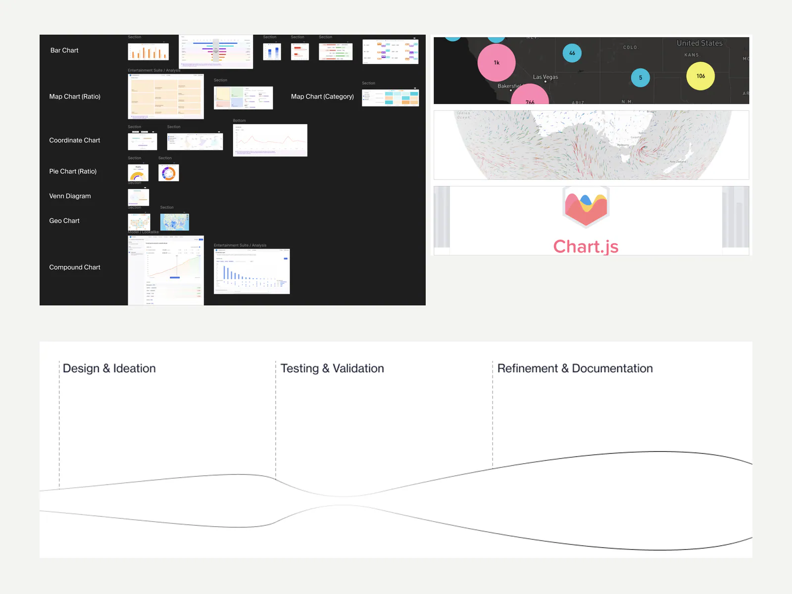
I led the effort to update Akkio's data visualization practice and created a chart library—covering system rules, additional chart types, responsive behavior, interaction states, prototypes, documentation, and engineering collaboration.
Team
Jackson Jiang
Luka
Engineering partners
Process
Audit
Competitive Research
Feasibility Scoping
Iteration
Deliverables
Chart Library
Responsive Rules
Prototypes
SDK Collaboration
Akkio
Akkio Chart Library is a modular data visualization system for readable, responsive, AI-generated charts.
Legible under real world data
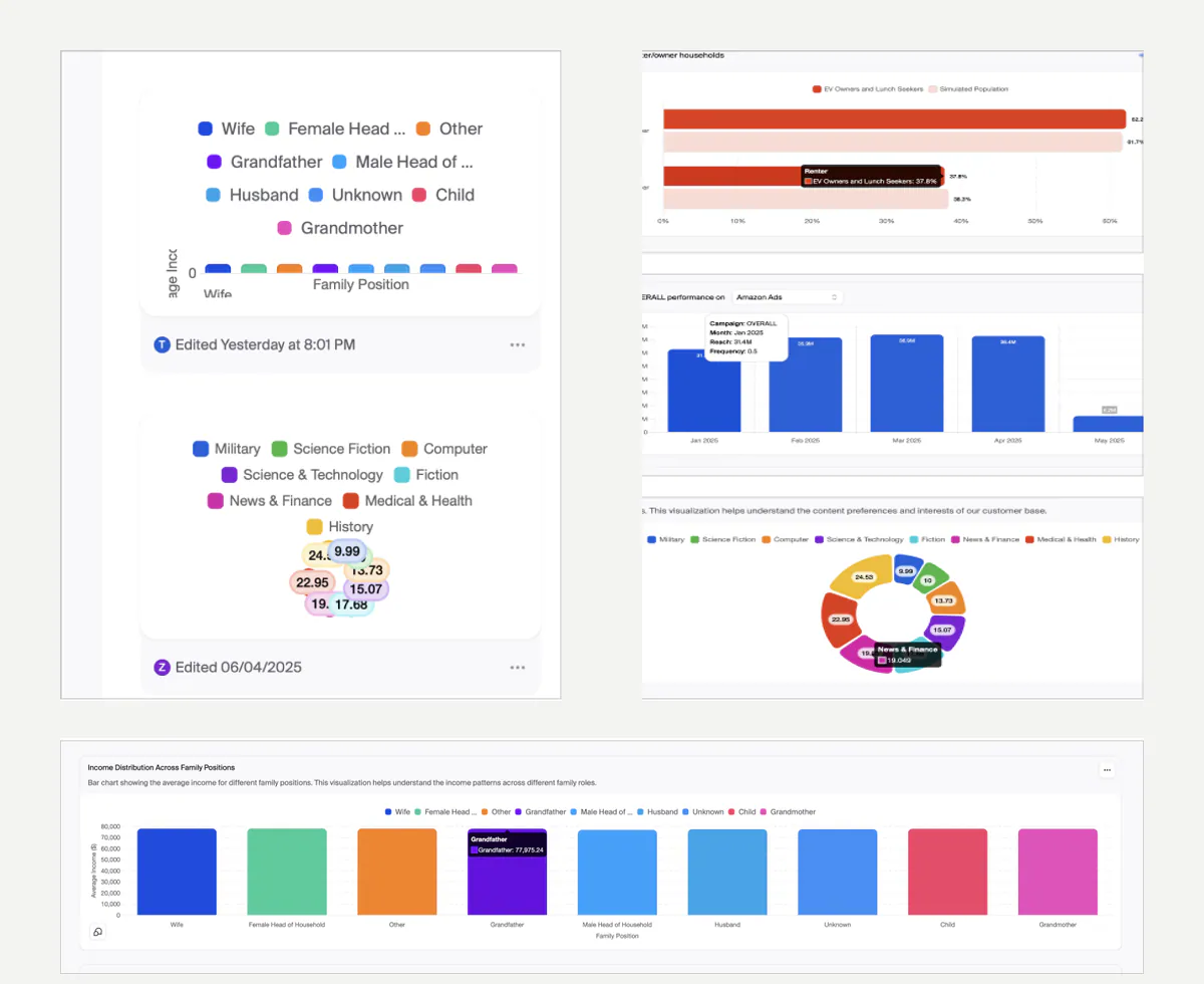
The system had to remain understandable when labels ran long, series multiplied, values clustered, or a chart moved into a smaller container.
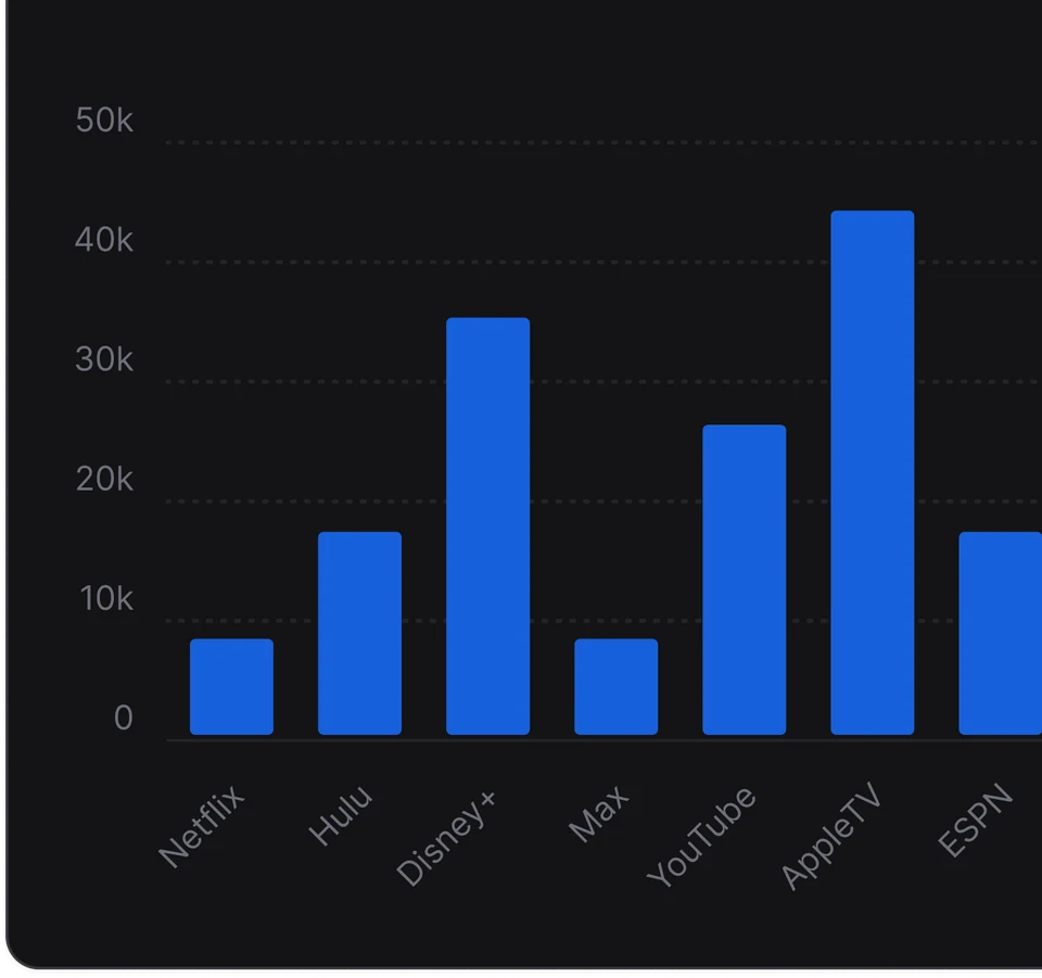
Bar chart with crowded category labels angled to remain readable
When category labels start to crowd, angle them to preserve legibility without hiding data.
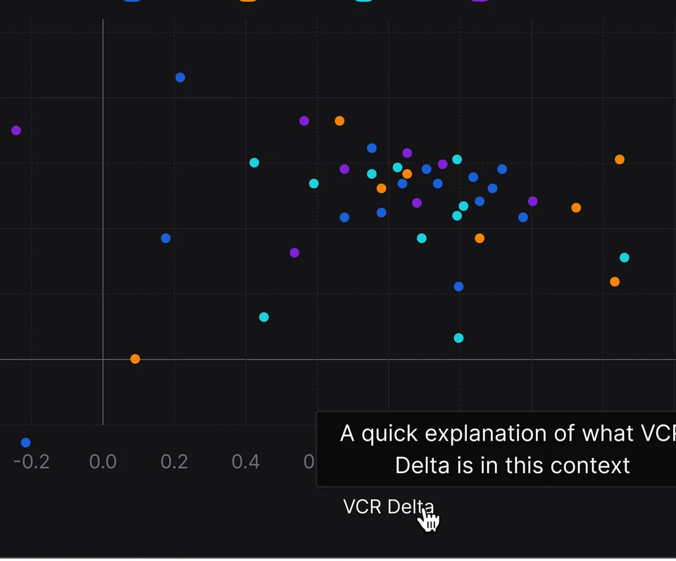
Scatter plot with a hover tooltip explaining a selected data point
Always include hovering tooltips, so the chart is not only readable, but also understandable.
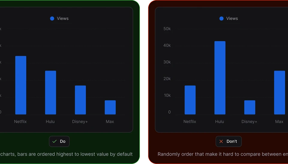
Do and don’t examples comparing ordered and randomly ordered bar charts
For special scenarios, I included detailed do’s and don’ts to help prevent inconsistency and support logical, data-driven design decisions.
Scalable system that could grow past its first release.
Instead of defining one fixed look for every chart, I designed swappable chart components, modular information blocks, and shared rules that could extend to new types and sizes.
Interaction designed for AI-generated analysis.
Generated charts need to communicate what is happening before data appears, when data is missing, and when a user wants to investigate a precise slice of a larger result.
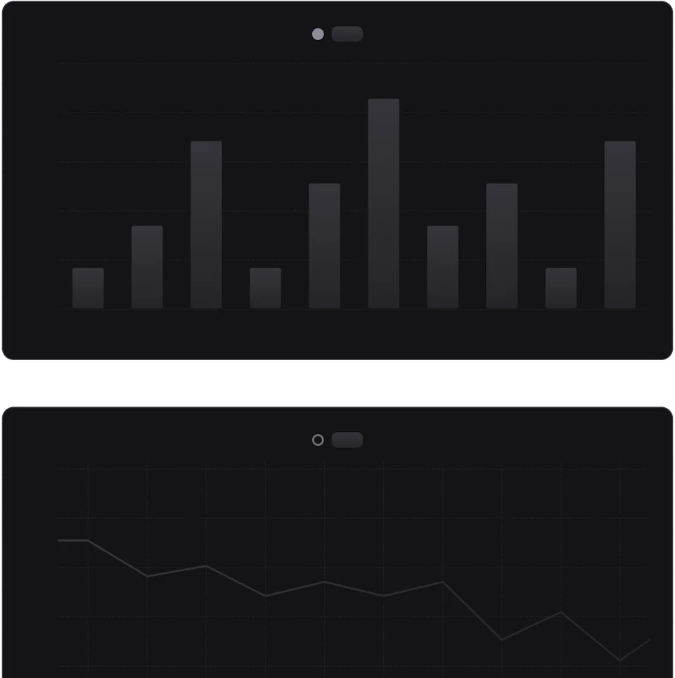
Loading and empty states communicate what is happening before data appears, or when data is missing.
Loading-state bar and line charts shown before generated data appears
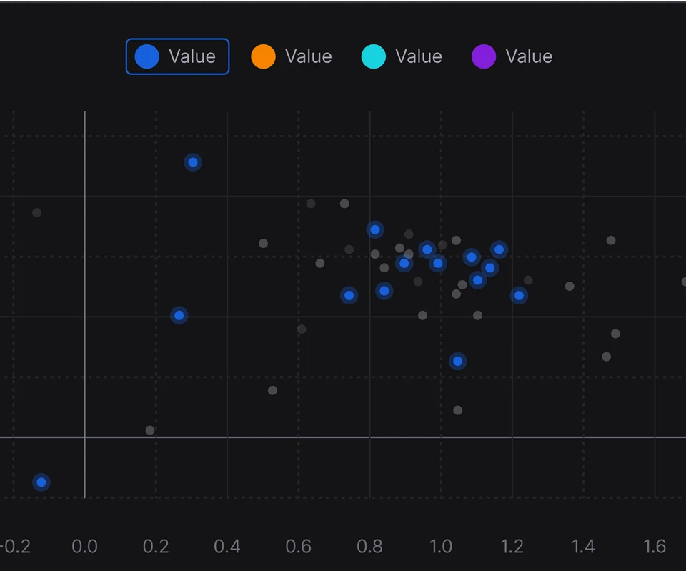
Users could select precise regions within layered datasets for focused analysis.
Scatter plot with selected points highlighted across a larger dataset
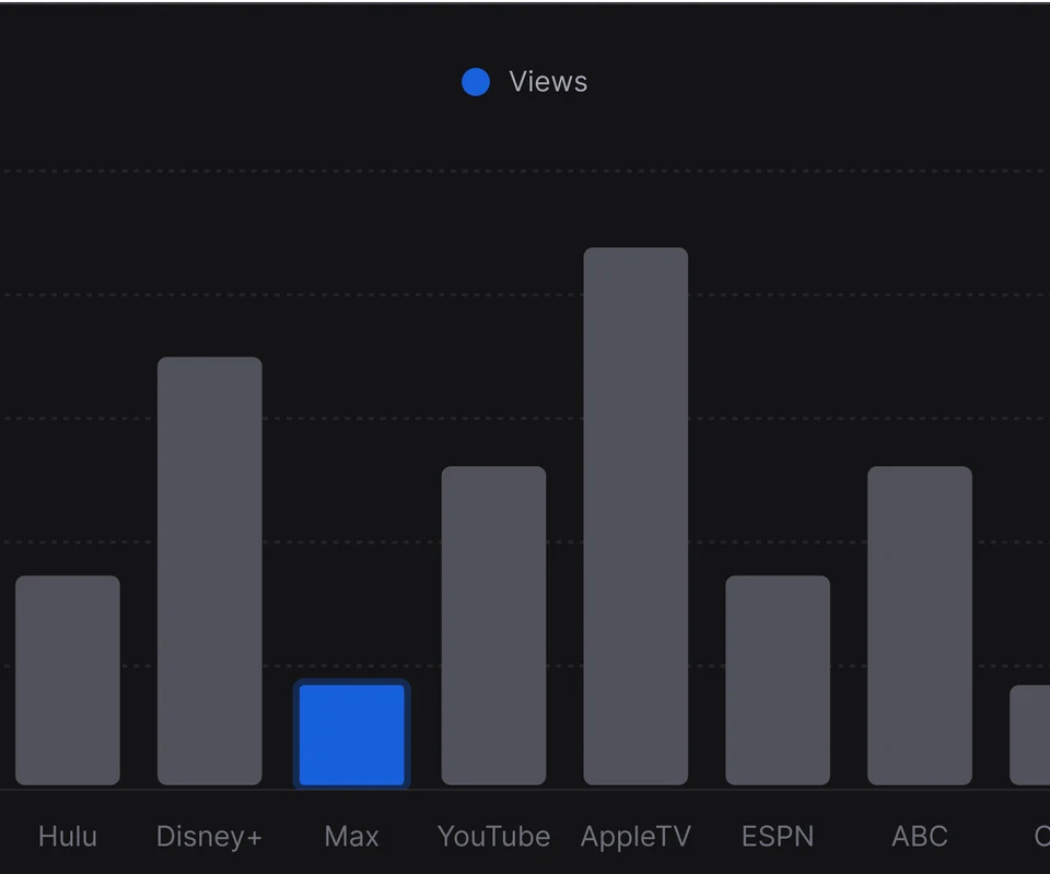
Selected data remained comparable across chart types before users asked AI what was significant.
Bar chart with one selected category highlighted in blue
Akkio
Akkio Chart Library
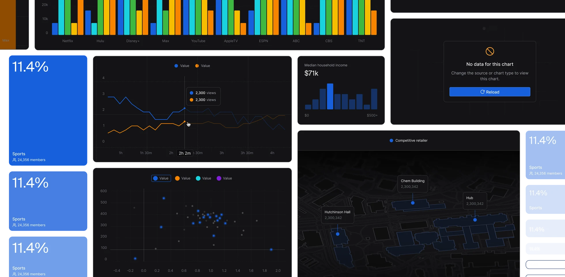
Production collage of Akkio KPI cards, charts, map visualization, and empty states
Impact
A shared language across the platform.
The modular library let designers assemble new chart layouts in minutes and sharply reduced repeated engineering work. Responsive patterns expanded data visualization into tooltips, project tiles, and other compact surfaces while preserving a consistent platform-wide language.
Reflection
The durable outcome was not a fixed collection of charts, but a rule system designers and engineers could extend to new chart types, sizes, and AI-driven interactions.
Credits
Luka
Ekin
Robin
Jeff
back to top
Intro
Legibility
Scalability
Interaction